12 Joys of Colour:
In the lead up to Christmas 2019 I posted my 12 Joys of Colour series which was inspired by the 12 Days of Christmas. In this blog I explore the 3 primary colours: red, yellow and blue.
Day 7 – Red
Passion, energy, optimism. Anger, intensity, dominant.
Red is a truly versatile colour which is linked to extremes of emotions, feelings and situations. Bright versions are perceived as being more energetic, and dark shades, more powerful and elegant.
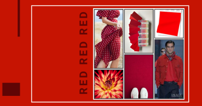
Red sits on the warm side of the colour spectrum. Warm hues advance and draw our attention – think stop signs and fire trucks. This is an interesting fact to remember when dressing in red because wherever you wear it people will pay attention. E.g. Trying to hide your thighs? Red pants will emphasise that area. Instead, wear a red top and draw the eye up and away from your bottom half.
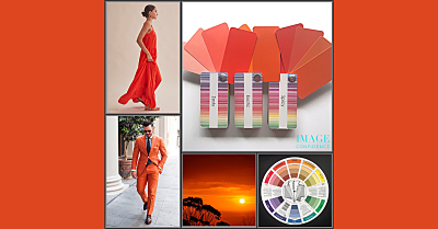
Pantone, the world’s leading authority on colour and colour trends has recently released their predictions for Spring/Summer 2020. One of those colours is youthful and empowering ‘Flame Scarlet’ (featured in the top right corner of the collage). The great news is that this hue looks good on almost everyone! If you’ve shied away from this bright version of red in the past, perhaps next Spring will be the perfect opportunity to try it.
How do you feel wearing red? Conspicuous? Confident? Determined? Energised?
Images: Pantone, Unsplash, Pinterest
Day 8 – Blue
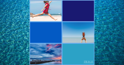
Writing about blue I’m thinking of summer happiness: blue skies and warmer weather. Also, the relaxed, holiday feeling you get when you see azure, turquoise blue waters at tropical destinations like Cairns and Hawaii. Wearing lighter versions of blue evokes a sense of playfulness and fun.
When I think of deep blues, other associations come to mind like trust, authority and power e.g. police uniforms and business suits.
Classic Blue is Pantone’s 2020 ‘Colour of the Year’. Leatrice Eiseman, executive director of Pantone said, “When we look at the world around us, we know that we’re living with a lot of unrest… Blue… has always represented a certain amount of calm and dependability… this particular shade really gave us that feeling of confidence and stability.”
Even though blue is a colour, i.e. not a neutral, it works well for the basic garments that are the ‘work horses’ (essentials) in your wardrobe, like pants, jackets, skirts and jeans.
Choose your best versions of blue by taking your unique colouring (hair, skin and eye combination) into account. That way you’ll always present the best version of you and feel good about your clothing choices.
Images: Pinterest, lifewire.com, uniqtravel.com
Day 9 – Primary Hues: Yellow
Hello to happy, cheerful, optimistic yellow!
If you’re feeling mentally exhausted and there’s still a lot to do, wear a small amount of yellow (it could be in a pattern) to stimulate your mental activity and concentration levels.
Yellow is a warm, bright hue that vibrates on a high frequency, so it grabs our attention. Even though most of us think of its positive connotations, many people shy away from wearing yellow because it can feel intense or overwhelming – especially if you’re experiencing major changes in your life.
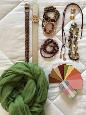
There are versions of yellow to suit everyone from soft, icy lemon to vibrant canary. During a colour consultation at Image Confidence we compare 18 different colour groups to identify which colours harmonise best with your complexion, eyes and hair. You receive a swatch (mini fan-deck) of 40+ colours to use as a guide when shopping for your wardrobe.
Red, blue and yellow are just some of the colours in your palette that will have you looking good and feeling great!
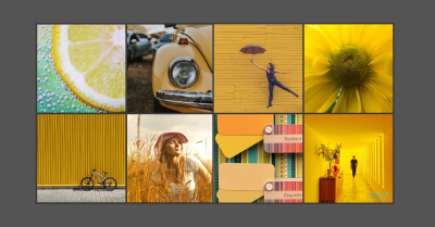
Images: Pinterest, Unsplash
Contact me if you would like to feel empowered and self-assured about your image in 2020.
A Personal Colour Consultation is fun and is an investment in you.

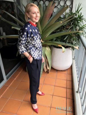
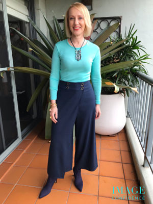

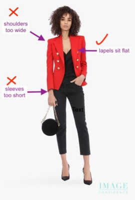
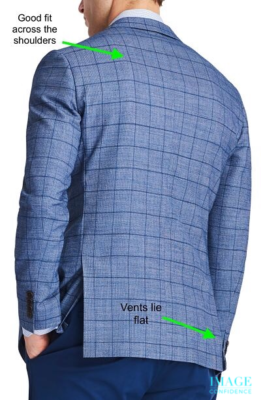
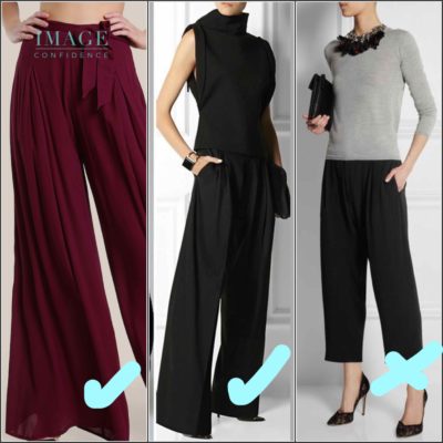
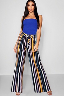
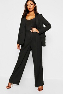
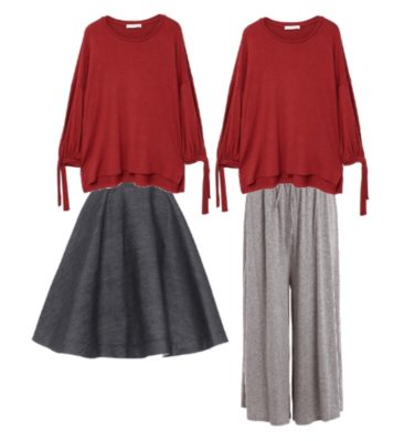
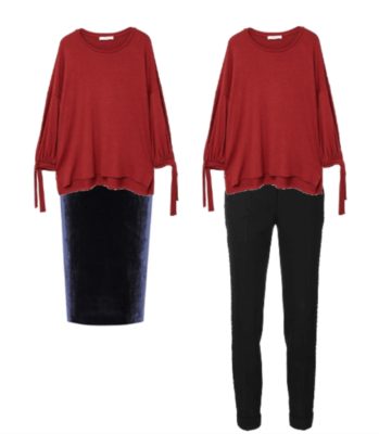
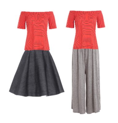
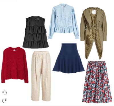 When two voluminous items are worn together the look becomes boxy and shapeless. The fabric swamps you and makes you look larger. The picture on the left (below) shows examples of this.